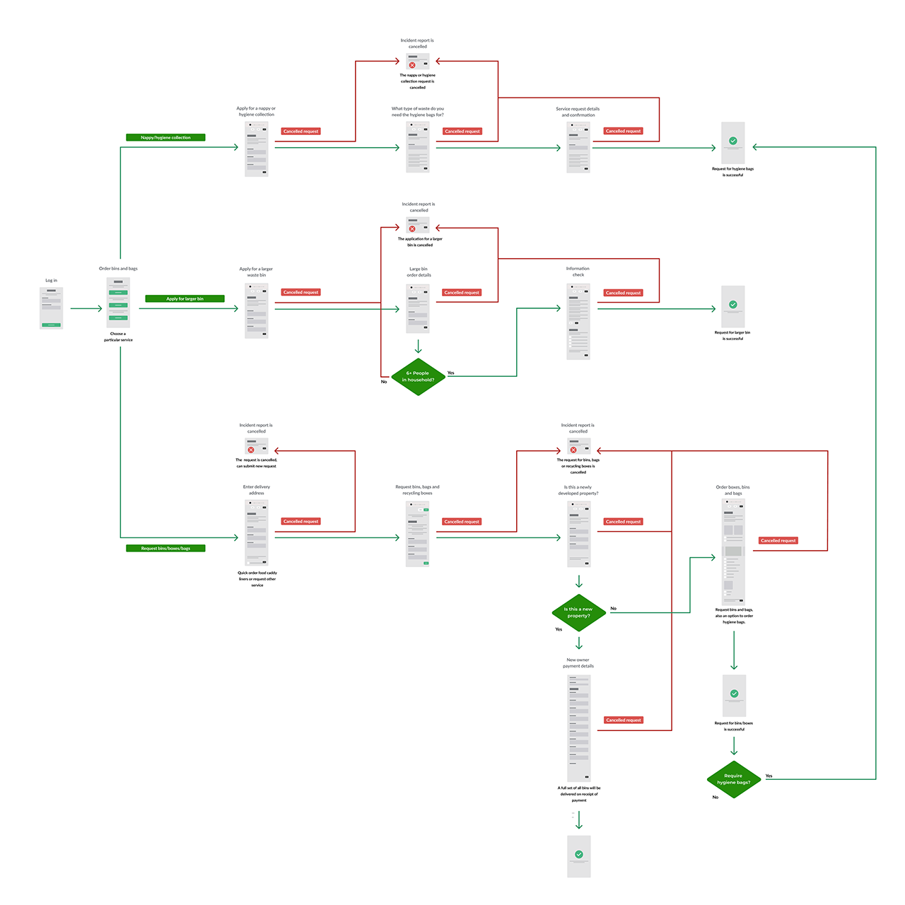
RECYCLING
SERVICES
REDESIGN

It needn't be a rubbish experience…

Project brief

To improve the effectiveness, clarity and overall experience when requesting recycling bins and services online.

Usually I live by the UX mantra "I am not the user", but in this case I am!

It was my frustration with the existing system that made me look into how it could be improved. Who knows, maybe someone from Newport Council is watching?!

My aim was to:

  • increase efficiency by simplifying the overall request process
  • increase the effectiveness by improving the onboarding process and reducing the potential for user confusion
  • ensure the resident has a positive experience by only requesting information when necessary and reducing the number of requests for details.

UX FLOW DIAGRAM:

I wanted an overview of the full list of recycling services that needed to be considered.

I wanted to discover any inefficiencies/replication in the current process, so I developed the following UX flow diagram.

UX Flow Diagram of the existing process Download the UX Flow Diagram

Potential pain points:

  • There is no access to the top-level menu for the site once a user request has been cancelled for any of the 3 tasks.
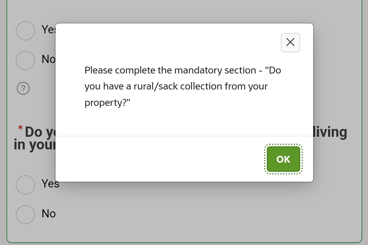
  • The same details are requested on numerous occasions during the process.
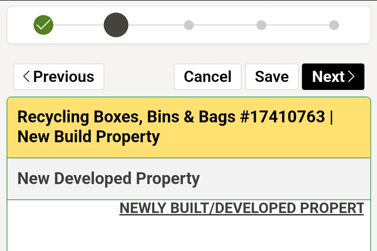
  • It is possible to order hygiene bags at the end of the request for a full set of bins to a new property, but this isn't clear from the the initial 'order bins and bags' screen. Residents may have already (unnecessarily) completed the hygiene bag request form and have to enter the same name, address and personal details at least twice!
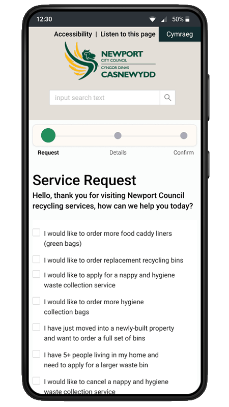
  • New property owners are informed that they will receive a full set of bins once payment is received, but only once they have entered their details and made a bin request - this would be very frustrating for residents who are not responsible for purchasing the bins.

Evaluation:

As well as issues with user flow, I also wanted to highlight any specific usability concerns and obstacles that may have made my experience frustrating enough to build an alternative prototype!

Ideally an analysis should be undertaken by a team of 3 to 5 designers and their findings cross-referenced, but the reality is that this is a personal project with no budget so 1 will have to do!

I felt that the narrow scope of the evaluation (purely concerned with the request form usability) meant that I should be able to identify enough of the main pain points on my own to improve the user experience.

In an attempt to avoid personal bias I used Jakob Nielsen et. al's 10 usability principles as a framework for the analysis.

The main roadblocks and areas of friction my evaluation found were as follows (this is not a comprehensive report of the evaluation findings):

Progress indicator without text

#1: Visibility of system status

The design should always keep users informed about what is going on, through appropriate feedback within a reasonable amount of time.

  • A progress indicator is present on every page during the request process, but it doesn't inform the resident of the exact stages required or the tasks completed (no textual context given, just a green tick indicator).
  • Progress through the process is only displayed by a subtle increase in the size of the indicator icon and change to a darker grey, needs to be made more obvious for users.
Previous button left-aligned with accompanying text Previous button right-aligned with no text Previous button left-aligned with no text

#4: Consistency and standards

Users should not have to wonder whether different words, situations, or actions mean the same thing. Follow platform and industry conventions.

  • There is inconsistency between the look and position of buttons throughout the process; sometimes they are yellow and sometimes black, sometimes left-aligned accompanied by text and others right-aligned with no text.
  • The button to proceed to the next stage of the request is labelled 'Next' at the top of the screen, but 'Continue' at the bottom - residents can't be 100% sure these buttons will perform exactly the same actions. Neither button contains a forward chevron to mirror the 'previous' buttons.
  • The instructions used on the buttons are inconsistent; 'back' and 'next' would be a more logical pairing in my opinion.
Newport council error modal

#9: Help users recognise, diagnose, and recover from errors

Error messages should be expressed in plain language (no error codes), precisely indicate the problem, and constructively suggest a solution.

For me, this is the most obvious pain point in the process.

  • Residents are only informed of any errors when they try to continue with the request process, and then only on a small modal in non-descript text – the lack of flags and constructive error messages places too heavy a cognitive load on the user.
  • The resident needs to recall the exact form field where the error occurred and the nature of the problem (the diagnostic modal has to be closed before the error can be corrected).
Prototype service form
  • The task set was to order caddy liners, hygiene collection bags and a new red bag because the old one is weathered and torn
  • Selecting an input field twice will autofill the field
  • Press the x key when an input box is in focus to reveal the error message
  • Press Enter to set an input box to its default state.

Test

One of my main objectives was to increase the efficiency of the ordering process, which should mean that the tasks take less time to perform, so I set users a specific scenario and measured the time taken to complete the task.

The average completion times are shown below:

Average time to complete existing form:

Average time to complete prototype form:

Success! I've nearly halved the time it takes residents to complete the task

As well as timing the resident's performance, I also made a note of any comments made during testing and received some positive feedback about the new design, such as:

The tasks are a lot clearer than a load of do's and don'ts…

I like the traffic light system, makes it clear for me to see what I've ordered…

I'm glad I haven't got to scroll all the way back up the page in this version to submit my order…

Takeaway

Reflection:

  • I found it really cathartic and rewarding to redesign a frustrating user experience.
  • It's very pleasing and a confidence boost to see such clear evidence of a design improving the user experience.
  • By sticking to the aesthetics and components of the existing site (not designing a 'rockstar' replacement) I feel I gained an insight into the real-world design issues the council website faced. My empathy with the designers/developers also increased as a lot of the issues will no doubt be caused by the limitations of 3rd party systems!
  • It's beneficial to base design decisions on quantitative and qualitative data (completion times and residents feedback in this case).
  • The process of replicating input element interactions in Figma was more time-consuming than I'd hoped. If the components I've already built for this study can't be easily repurposed in similar future studies, then I may just build a dummy contact form in Bootstrap etc.